Fitness & wellness · Tây Hồ, Hà Nội · 2026
Aqua Gym: a calm, bilingual brand identity for aquatic fitness in Hanoi
Aqua Gym
PROJECT OVERVIEW
Aqua Gym runs small-group fitness and recovery classes in a warm, quiet pool in Tây Hồ, Hà Nội. We built the brand identity: a logo system, a five-colour palette, a bilingual type system and a voice guide. Version 1.0 was completed in October 2026 and the identity is now in use.
THE CHALLENGE
What Needed To Change.
The brand had to feel like the water: clear, steady and unhurried, with real effort underneath. It also had to work in two languages from day one, English and Vietnamese, with full diacritics everywhere. And because the classes are fitness, not medicine, the brand needed clear rules so that nothing it says sounds like a medical claim.
THE STRATEGY
How We Approached It.
Four principles guide every decision: Calm (unhurried pacing, white space, soft curves), Confident (clear, specific statements), Quietly athletic (real training, low impact, effort shown not shouted) and Bilingual (every touchpoint in English and Vietnamese). The tagline is "Train. Recover. Flow."
BRANDING
The Brand.
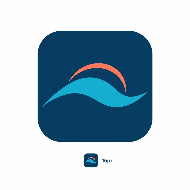
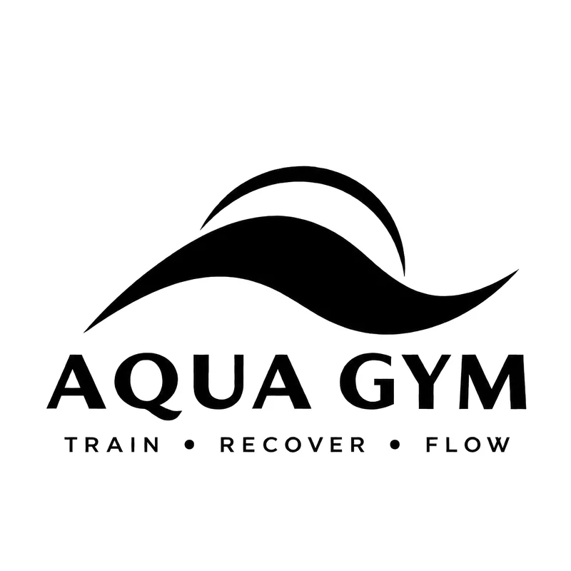
A wave and a coral sun arc form the mark. The system has a horizontal lockup (the default), a stacked lockup for square and centred layouts, a dark-background version for navy, an icon for small spaces, an app icon and favicon, and one-colour navy and black versions. Clear space equals the height of the sun arc. Minimum sizes: horizontal 30 mm / 120 px, stacked 20 mm / 80 px, icon 8 mm / 24 px. The guide says which file to use where, and lists what never to do: stretch, recolour, box, rotate or redraw the logo.
COLOUR
Five Colours.
Five colours, no gold, no gradients. Navy leads for text, buttons and dark sections. Aqua is the accent. Coral belongs only to the sun arc in the logo, never to the interface. The proportion is about 60% white and mist, 25% navy, 10% aqua and 5% coral through the logo. Navy on white and white on navy are the reading pairs. Aqua and coral are never used as body text on white. Print values (CMYK) are included for each colour, to be confirmed against a printed proof.
- Navy#0B3C5D
- Aqua#1CA7C7
- Coral#FF7A59
- White#FFFFFF
- Mist#F4F8FA
TYPOGRAPHY
Two Typefaces.
Plus Jakarta Sans for headings and Be Vietnam Pro for body. Both are free on Google Fonts and fully support Vietnamese. The guide sets a hierarchy from display to caption, sentence case for headings and buttons, and uppercase only for small labels. Rule: never substitute a typeface that cannot render Vietnamese.
VOICE
Speak Like A Good Coach.
- Speak like a good coach at normal volume: short sentences, specifics over adjectives, "you" in English and "bạn" in Vietnamese. No hype, exclamation marks or emoji. No medical claims.
- Example: "Low impact on your joints, real work for your body." / "Nhẹ nhàng với khớp, nhưng cơ thể vẫn làm việc thật sự."
- Every message carries one required line: "Aqua Gym classes are fitness classes, not medical treatment." / "Các lớp của Aqua Gym là lớp thể dục, không phải điều trị y tế."
DELIVERABLES
What Was Delivered.
- Brand identity guidelines v1.0 (11 slides, bilingual)
- Logo files in six versions
- Colour palette with HEX, RGB and CMYK values
- Typography system and hierarchy
- Voice and writing guide
BUILD WITH ERIA
Ready To Build Your Next Evolution?
Every transformation starts with the decision to build something better. If you're ready — Eria Brands is ready to build it with you.